

Atlanta Preservation Center
Rebranding, Marketing, Editorial
August - December 2025
Role: Creative Direction
The Atlanta Preservation Center is a non-profit organization rooted in protecting historic buildings in Atlanta. I collaborated with a group of five designers to rebrand their visual identity in order to modernize and attract a larger audience.
A Brief History
The Atlanta Preservation Center is a nonprofit organization dedicated to protecting historic buildings in Atlanta. Its mission is to promote the preservation of Atlanta’s architecturally, historically, and culturally significant buildings, neighborhoods, and landscapes through education and advocacy. The nonprofit was founded in 1979, and then expanded its scope in 2003 to include Phoenix Flies, an annual celebration of Atlanta’s historic and cultural assets
objective
We were approached by the Atlanta Preservation Center to redesign its visual identity to inspire a younger audience to join the historic preservation movement while ensuring its existing, older demographic continued to feel represented.
Over time, multiple logo iterations and contributions from different collaborators caused the original logo to lose its meaning. Rather than clearly representing the institution, it had become a vague image disconnected from its identity.
Another challenge was Phoenix Flies, an annual event established in 2003 to celebrate the restoration of the Plaza Theatre and encourage the community to come together. Its visual identity had become overly complicated, making it difficult to communicate effectively.
Approach + Research
We began by exploring what attracts younger audiences to organizations and identifying opportunities to make the visual identity more engaging and relevant. At the same time, we needed to preserve the familiarity of the existing brand, staying close to the original logo's colors and shape to maintain continuity with its established audience.
iterations
After completing our research, we dived into exploring new logos as well as some color palettes. The black-and-white logos on the left are a few of our very first drafts. As a team, we collaborated and picked two logos that we believe fit best. One would be the primary APC logo, and the other being the secondary logo specifically used for Phoenix Flies. We then forwarded this for approval and feedback from the Atlanta Preservation Center. W
FInal logos
After receiving feedback from the Atlanta Preservation Center, we were told that the primary logo may deviate too much for it to be recognizable to their older audience. We pivoted and reverted to a logo that more closely resembles the original logo. We also received some critique that the Phoenix Flies logo does not seem to have any connection to the primary logo. For this, we added the sun-like shape into the Phoenix to make both logos look cohesive.
deliverables
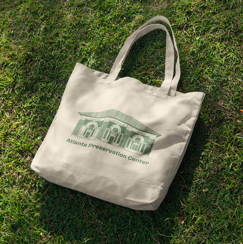
After receiving final approval for the branding, the team was able to move on to creating deliverables. The deliverables include merchandise like tote bags, hats, and a book containing information on Phoenix Flies events. We chose merchandise as the primary vehicle for the new branding, as it would attract both target audiences and encourage people to attend the events and participate.


results
Out of the many deliverables, not many had the opportunity to be produced in time for Phoenix Flies 2026. However, the Phoenix Flies 2026 book was produced! Many members and participants in the Phoenix Flies celebration have been promoting the book and events on social media. On top of that, our rebranding can be seen across the Atlanta Preservation Centers' website and social media.